
Any discussion of double-page art spreads in comics would be woefully incomplete without the inclusion of groundbreaking artist Jim Steranko, who practically wrote the book on the subject. For Steranko--who as a matter of course ignored page boundaries and had his characters appearing, well, all over the place--extending his talents to double-page spreads seemed a foregone conclusion. In fact, there were often times when one wondered if two pages were enough for this guy. (Though we'll come back to that in a minute.)
Steranko's work for Marvel included stints on X-Men, Captain America, and of course those wonderful late '60s issues of the combo book Strange Tales (which split the book between Doctor Strange and Nick Fury). I really didn't care much for his art on X-Men--but his dynamic style seemed perfectly suited for characters like Cap and Fury, who relied more on physical attributes and movement than powers. Also, their conflicts usually found them in the middle of swarms of Hydra or private armies--which meant that these two men of action were always in the thick of things, right where they belonged.
As an added treat and visual feast for the eyes, Steranko's work for these two books was embellished by none other than Joe Sinnott, whose polishing skills could probably make the work of even the most lackluster artist stand out. In the case of Steranko, the finished product was simply breathtaking. And when you translate that level of work to a double-page spread, it becomes a display that you'd easily want framed. For example, this two-page rendition of Captain America, taking on the hordes of Hydra:

And look at the nice touches that Steranko adds to make this kind of scene have more impact. This could easily have become a more heroic picture, where Cap tears into his foes and begins to make short work of them--but Steranko, who also wrote a lot of his stories, shows not only the utter chaos of the battle but the almost desperate situation that Cap and Rick find themselves in. Instead of determination in Cap's eyes, we see him trying to come to grips with the situation and form some kind of attack plan against heavily armed foes who greatly outnumber him. And Hydra clearly is taking no chances with him.
Steranko plays Cap similarly in these two scenes, where Cap, while still every inch the hero, is by no means the predetermined victor in the unfolding fight:


And then there's Nick Fury, who under Steranko's writing and art became a super-spy. Nick Fury as an action hero, frankly, never did anything for me. He made much more of an impact for me in a decisive role, calling the shots. It's like when writer David Gerrold described how the more interesting thing about Capt. Kirk is not when Kirk is in danger, but when Kirk makes a decision. In Fury's case, the best scene I can think of to illustrate that is when Tony Stark has asked him to consider becoming the head of SHIELD, and during the meeting he ends up foiling a plot to destroy the helicarrier and everyone aboard. Just look at how everyone snaps to at the orders of this guy in the chaos that follows. Mind you, he doesn't even have the job yet:

Steranko, though, puts him in a much more active role. And while I may not have been on board with Fury as a field agent, I certainly can't fault Steranko's effort. In any event, he did raise SHIELD's profile quite a bit, battling the likes of Hydra and the Yellow Claw. Here's a two-page mid-air battle that Steranko laid out:
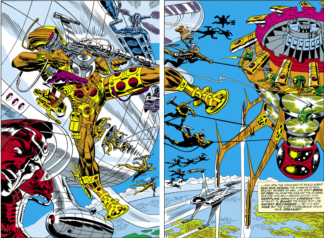
As you can see, there were instances where two pages of the art couldn't be seamlessly joined--though in book form, with a crease and staples in the middle, you took that as a given. ;)
Looking back on double-page artwork, it's interesting that Steranko ended up making comics history in this regard in a book as under the radar as Strange Tales--which, with stories of SHIELD's missions against exotic threats as well as the bizarre adventures of Doctor Strange, certainly lived up to its name. Yet it was in this book that readers saw comic book art's first four-page panorama, as rendered by Steranko and Sinnott. Of course, this was before the days of fold-outs or wrap-around covers making the viewing of such artwork possible (the launch of X-Men #1 in late 1991 being a good example), so you had to turn the page in order to see the rest of the art. Marvel, in a caption, even went so far to suggest buying a second issue, so that you could place the two double-pages together.
I think you might agree it may have been worth shelling out the extra 12¢:

Steranko's work in comics didn't extend much past the early 1970s, once he'd left his position on Marvel's fan magazine at the time, "FOOM." But he's nevertheless regarded as a unique talent in the industry, producing a strong body of work that put quite a stamp on Marvel. On the whole, I suppose I'd describe his style as "unconventional." His single-page art is no less impressive, but please don't take my word for it--check that out yourself if you have the chance.
6 comments:
Great stuff. I've added your site to my blog list, but for some strange reason it isn't showing publicly, although it's in my complete blog list which readers have to click on. (I'll work on it.)
Tell a lie - I was looking in the 'P' section instead of the 'T' section (under 'The'). Your site is showing publicly sure enough.
Hey, thanks so much. :D
Steranko's two-page spreads are very reminiscent of Alex Schomberg's Golden Age covers; there is so much action going on that you have to spend awhile looking at them just to figure out what is going on. I have a complete run of the Agent of Shield issues and the only criticism I have of his art is that the spectacular pages and panels make the normal pages and panels look pedestrian by comparison.
That's a good point about there being such a plethora of action in his spreads that you have to spend some time sifting through it all. In Steranko's case, that certainly can be time well spent--it's often such eye candy.
Steranko's double-page spreads, whenever practical, were on pages 12 and 13, the exact middle of Marvel Comics in those days. Easier to line up the two halves of the pages that way.
Post a Comment