Showing posts with label artwork. Show all posts

Monday, May 29, 2023

Amazing Spider-Covers


While one of the pleasures of browsing a comic book store (or even a comic book display in a store's book or magazine section) is letting your eye wander across those eye-catching covers that are doing their best to entice you to take that issue home, the experience becomes even more of a reason to kill some time when the cover artist is being innovative not only with the character(s) portrayed but also with other elements of the overall image. (Bill Sienkiewicz's work might be one example that would come to mind in that respect.) And so having recently been preoccupied looking through various Spider-Man titles, I thought I'd pick out a few such issues to share which were especially eye-catching to me, where even the issue's masthead at times became collateral damage.

Let's start with what may be a surprising choice to some of you--artist/writer Ed Hannigan, whose work you may remember from The Defenders but whose covers from Amazing Spider-Man and Peter Parker, The Spectacular Spider-Man in the early 1980s were at times groundbreaking in terms of bringing more artistry to a cover image than what you were expecting.


Thursday, May 11, 2023

Time Keeps On Slippin', Slippin', Slippin'...


Good grief, I thought in our senior years we became less busy.  Where does the time go? Wherever it's fled to, I'm running low on it this week, so I thought I'd once more raid my cache of graphics that I've stored from here and there and cobble together a little John Buscema goodness for you--mostly prior work that never saw the comics rack, with one or two homage prints thrown in.

Leading us off is someone else who appears to have run out of time--the Silver Surfer, who in an unpublished Buscema cover from his first series falls victim to none other than the heir of Frankenstein!


Monday, May 8, 2023

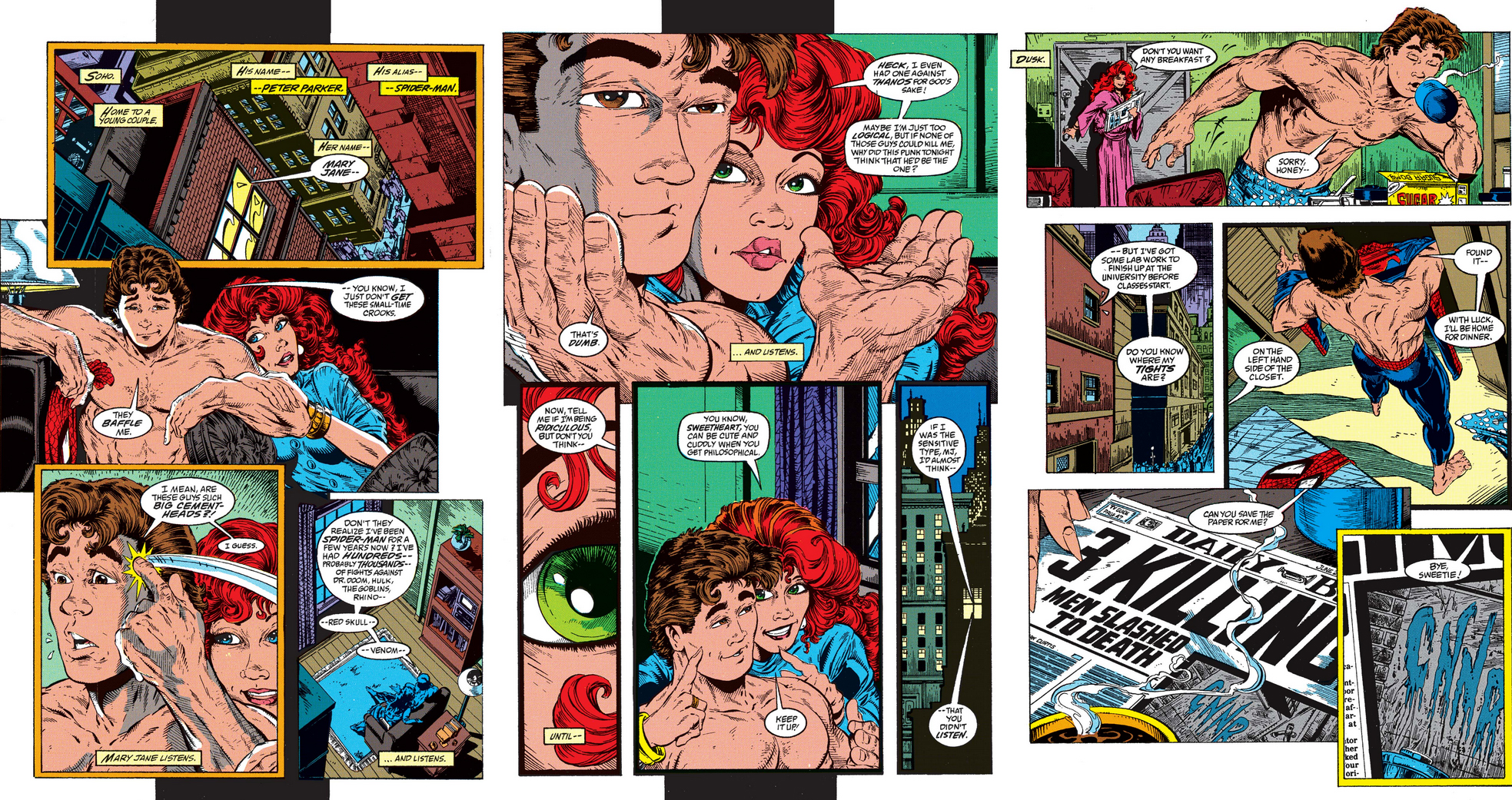
Todd McFarlane's Marvel Comics Work, 1988-91


From the sources I've seen on the subject, there appear to be mixed opinions among readers, and among those in the comics industry, on the work which Canadian artist/writer Todd McFarlane produced in his time at Marvel Comics during a nearly four-year period. Having been a reader throughout those years, I remember my interest waning not long after his new Spider-Man series was launched in the fall of 1990, a book he would produce as both artist and nascent writer. (Though it bears mentioning that the early 1990s presented me with a number of books which had me questioning the quality and direction of Marvel's offerings.) In the beginning, however, when McFarlane joined writer Peter David on Incredible Hulk, I found his approach to be fresh and bold, a unique style for the Hulk that was just as surprising and interesting as that of artist Jeff Purves in the character's subsequent Joe Fixit phase.


McFarlane's time on the title ended after just seven issues, though by that time he had been brought on board Amazing Spider-Man during the run of writer David Michelinie, a gifted scripter and storyteller.  (Michelinie would also later compliment McFarlane as a talented storyteller he was pleased to be partnered with.)  Like many before him, Michelinie gave Peter Parker his share of ups and downs--a certain Christmas Eve being one of the latter instances, surely.


Reportedly feeling dissatisfied at the lack of control over his work and wishing to have more of a say in the direction of stories, McFarlane was appeased with his own Spider-Man title where he would have creative control--coming into the project as a profitable talent for Marvel and taking a turn toward a future for himself that was his to chart. Yet it was a run that would last just a little over a year, which saw McFarlane eventually develop more dissatisfaction in regard to his differences with editors on story and character direction as well as artistic choices for heroic characters that would have done the Marauders proud. By this time, his variant covers were also contributing to the growth of the speculator market which preceded the near-collapse of the industry--while there was also a curious recycling of previous cover styles to coincide with costume changes.


Whether you consider McFarlane's writing at this point in time to be compelling and entertaining is a valid debate to have, with McFarlane himself weighing in on the fact that he was just beginning to dip his toes into the field. In his later work for Spawn, published by Image Comics, he eventually (i.e., after an early rough patch) came into his own in that regard; but though riding a wave of popularity at the time of Marvel's release of a new Spider-Man book, and showing promise in his first issue, it became apparent over the course of the run that the strength of his artwork wasn't supported by equally robust storytelling for a character we were growing increasingly unfamiliar with.


Following his exit from the book, McFarlane would go on to join Rob Liefeld, Erik Larsen, Marc Silvestri, Whilce Portacio, Jim Lee, and Jim Valentino to found Image Comics, a company not without its own problems but which would turn out to be a stepping stone for McFarlane to even greater exposure and profitability, steadily establishing a media empire for himself which exists as a testament to his persistence and drive as well as his obvious affection for comics. You might find informative a 2000 documentary on the man produced by Kenton Vaughan, with appearances by McFarlane as well as industry peers; in addition, there's a column by David Wallace which covers most if not all of McFarlane's growth in the comics field. The opinion that McFarlane's best overall Marvel work can be found in his partnership with Michelinie in ASM is one that I agree with--but I found myself pleased to see how he built on his beginnings to excel in his chosen field, and remarkably so.


Monday, October 25, 2021

Marvel's Classic Corner Boxes: Fantastic Four Vol. I


Nine years ago, the PPC briefly took a look at those eye-catching corner boxes which once graced the left corner of issue covers and featured the character(s) which starred in the comic you took home to read. At the time, we explored the subject within the context of where the art for the characters might have originated from; but during this week, we'll expand our look to showcase a near-entire run of a title's first volume of corner boxes in all their mini-glory, from beginning to end. And why not begin where Marvel began, in the comic which set the standard for its new line of super-hero books?

It took a year and a half for the first corner box to appear in the Fantastic Four comic since its launch--but with variations, that box would endure for the next four years and appear in nearly fifty issues.


Thursday, October 7, 2021

The Earth's Final Hour!


Now what does this 1963 cover from artist Vic Prezio remind you of?


Reportedly, it provided the inspiration for a cover from Fantastic Four published three years later and rendered by artist Jack Kirby. The renditions of both artists were a bit before my time as a regular FF reader; having been a fairly new reader of the book in the early 1970s with only a little over twenty issues under my belt, I was still catching up on prior stories courtesy of Marvel's Greatest Comics, the successor to Marvel Collectors' Item Classics which had begun reprinting Silver Age FF stories in 1965 as part of its "grab bag" format but shifted in late 1969 to MGC which focused exclusively on FF reprints. Consequently, it wasn't until six years after the fact when I first read the story of Galactus, whose battle with the FF, for me, took place in MGC and was heralded in this case by artist Sal Buscema.


Obviously Mr. Buscema has a different take than Kirby on this story's cover presentation, preferring to show the FF in battle with Galactus rather than fleeing for their lives--but there are other interesting distinctions that bear mentioning. "If This Be Doomsday!", the title from which the original's caption takes its wording, is perhaps more at home above an image that has the FF appearing helpless against the threat, since the word "doomsday" implies a final hour that no one can avert or escape--whereas on the MGC cover, doomsday seems less likely with Galactus, in full view, being less of a lofty figure from on high and laser-focused on dealing with the FF. Kirby's image is also helped by a more apocalyptic background rather than a more serene setting of a clear day that suggests this battle is an isolated one and not a danger to the city, or the world.)

In addition, Buscema's cover is forcing us to assume that the Torch has lapsed on the ledge of a building other than the FF's headquarters, since Galactus's conversion device was constructed on the Baxter Building. We're also left to assume that the Invisible Girl, whom Buscema doesn't appear to have room for, is either looking distraught from below, or is rushing from off-panel to help the Torch--that is, after she's:

  • Taken the FF's elevator to the lobby;
  • Hurried across the street while dodging traffic (where none of the drivers seem to know an FF uniform from a bike messenger);
  • Darted inside the other building, nearly tripping over a manhole cover;
  • Frantically pushed the elevator's Up button until one finally arrives;
  • Gritted her teeth at all the stops the car must make for the other people riding up with her; and
  • Nearly gone mad at not only the catty comments remarking on her disheveled appearance but also the incessant Muzak selections on repeat before reaching the roof.

The expressions on the faces of the rest of the FF seem to indicate their impatience as to what the heck has kept their distaff member--as opposed to Galactus, who for an instant can't help but wonder if all Earth females look so disheveled. In all seriousness, though, Sue is not present during this part of the fight (until the Punisher shows up, that is) due to being ordered to stay behind with Johnny, as a secondary force in the event Reed and the Thing fail in their attack. (You'd think a team's strength lies in fighting as a team, but what do I know.)

As it happens, the Torch isn't even part of this fight from this point on. By the time the Thing is wrecking crucial parts of the converter, the Watcher has sent the Torch to the world-ship of Galactus in order to obtain a device which would dissuade him from his plans for consuming Earth--which can be made to fall within the symbolic nature of Kirby's cover. (The Surfer is also occupied elsewhere, with Alicia Masters, as Buscema takes into account.)

A peculiarity in Kirby's cover, however, is that to the eye it seems as if the characters have all been nudged to the left, making things look a bit off-center--perhaps to make room for the doomsday caption, but also apparently to keep the masthead from being occluded by the helmet of Galactus (something that is evidently not a concern on the MGC cover). As with our friend the Frankenstein monster, Kirby's Galactus would evoke a more looming and menacing image if he had been placed center stage, as the overseer of the disaster to come. (Artist José Ladrönn does an excellent job of providing a workable solution with his variant cover to Vol. 2 of the Fantastic Four Omnibus, while also managing to bring the FF to the fore.)

BONUS!

A few of the covers featuring artists paying homage to this issue.
(In order, l-r: Jim Valentino, Paul Ryan, José Ladrönn, and Arthur Suydam)


Thursday, May 13, 2021

The Spy Who Overtaxed Me


When Strange Tales ended its run in May of 1968, it served as a springboard which launched each of its two principal characters--Doctor Strange and Nick Fury--into their own titles the following month. Doctor Strange would continue the former book's numbering and begin with issue #169--while the new Nick Fury, Agent of S.H.I.E.L.D. book would start off with issue #1. Prior to then, Jim Steranko had shepherded the SHIELD segment of Strange Tales successfully for fifteen issues, and it seemed that Marvel had struck gold with Steranko and his interpretation of the man who had been appointed as head of SHIELD. Who better, then, to spearhead Fury's new solo espionage series?


And yet the celebration of a new SHIELD series with Steranko at the helm was short-lived. As before, Steranko was working on a title being published monthly--but where Strange Tales offered a comfortable 11-12 pages for the writer/artist to produce, as he did for over a year, Steranko now found himself on the hook for twenty pages of story per month--inevitably running into deadline pressures as early as issue #4, when a story by Roy Thomas and artist Frank Springer was substituted and which retold Fury's installment as head of SHIELD and covered the events from Strange Tales #135 in more detail. Issue #5 subsequently turned out to be Steranko's final work on the series (though he would turn in cover art for issues 6-7), after which Springer would return as artist and several scripters would try their hand on the book.

But Steranko's early work for the series was nevertheless something to behold.  It was here he would introduce the character of Scorpio, who would later turn up as a member of the Zodiac crime cartel but who flies solo in this series and whose true identity will elude Fury until Steranko's departure. Until then, Scorpio would relentlessly pursue bringing about the death of Fury--beginning with an elaborate scheme that would use the resources of SHIELD itself, a scheme that would backfire thanks to the tenacity of its intended victim.


The battle between the two see-saws back and forth--but just as Fury seems poised to learn Scorpio's identity, a twist to this tale reaches its climax that first allows the villain to escape, only to then bring about his apparent death.

Yet Scorpio returns in Steranko's final issue, as Fury pursues a lead from SHIELD's telepathic operatives and he's forced into evading a series of attacks launched by the key of the Zodiac, which ultimately hem in on him and culiminate in his capture.


Scorpio's scheme this time is to cast a mask that allows him to impersonate Fury within SHIELD, and then arrange for Fury himself to replace a Life Model Decoy unit scheduled to be tested in a deadly chamber of fatal traps--nor do Fury's fellow agents realize the LMD is their leader, given that the face is masked (then pull it back, Fury--even I knew that!) and they're aware that the unit was programmed with Fury's own reactions and reflexes. Clearly Scorpio has an axe to grind with Fury that involves stress and suffering rather than killing the man when he was unconscious and helpless.

Yet, again, Steranko provides twists to this story that involve more than Fury and Scorpio--and eventually, circumstances result in Fury's pursuit of his foe, the man's literal unmasking, and another apparent end to the villain.


Scorpio would resurface (heh, get it?) in Avengers #72, where Fury has faked his own death (thanks to an attack by Bullseye) in order to infiltrate Zodiac as (you guessed it) Scorpio. Once the dust settles on the defeated cartel, and the Avengers learn that Fury is alive, the mystery of Scorpio's identity is at last revealed by Thomas, as Fury recounts what he'd learned in that last chase in which he saw Scorpio alive.


In closing the circle, Thomas also pays a bit of homage to Steranko's dramatic splash pages from issues 1 and 5 of Nick Fury, Agent of Shield, though Thomas's effort is somewhat disappointing in that it boils down to a play on words which takes its material from the lead-in to a joke.


Gerry Conway would also contribute his two cents in a Defenders story where Scorpio is out to create his own members of Zodiac, but sticks to Steranko's general theme for the splash page's wording:


Before Steranko would bring Scorpio back for his curtain call, he would provide us with some unorthodox Fury stories which featured the return of Jimmy Woo in his first appearance as a SHIELD agent, followed by a 1930s scientist bent on wiping out mankind--as well as a mystery which plays off Sir Arthur Conan Doyle's "The Hound of the Baskervilles"* (with an evil Nazi plot twist):

*Which, granted, strays from the "Agent of SHIELD" espionage angle a reader might have been expecting from this title.
 

Once Steranko departs the series, he leaves behind two covers for the stories which follow--one of which won the 1968 Alley Award for Best Cover.


Nick Fury, Agent of SHIELD would last for 18 issues, the final six shifted to a bi-monthly schedule. Springer returned to the series for six issues post-Steranko, followed by an appearance by Barry Smith, with Herb Trimpe pencilling the next three. But the book effectively ceased publication with issue 15, at which time it began featuring only reprinted stories from Strange Tales Nick Fury segments until the plug was finally pulled. Oddly enough, even then Marvel was promoting the book with new cover art, recycling Strange Tales for all it was worth.

(To which Nick Fury might have replied, "Nuts!")


Thursday, November 19, 2020

Part Two of Jack Kirby's Supplemental Covers, Circa 1976-1977


Having seen a few of Jack Kirby's supplemental covers for Marvel books, drawn during his own "supplemental" stay at the company during the years 1976-77, let's round out that post by taking the opportunity to "cover" a little more ground and moving on to some of the other titles which received Mr. Kirby's attention under their mastheads.

As was the case before, the books we'll see here might be surprising not only in terms of those titles that Kirby took an interest in, but also those that he opted not to contribute to (all of which is assuming these were Mr. Kirby's choices to make, rather than assignments from whoever was handling production matters). Frankly, with his workload as both writer and scripter of those books he produced on a monthly basis, the fact that Kirby managed to make room for the number of additional covers he turned in is something of a surprise in itself, to say nothing of not having lost his touch at making practically each of these cover images salesworthy as far as being able to stand out on the rack and entice the comics browser with the promise of adventure within. How regrettable that Marvel and Kirby were not able to work out a mutually beneficial way to coexist, though that's not to imply the dispute between them was one-sided. As we've seen in source material such as Marvel Comics The Untold Story, The Comics Journal, Wizard, and other forums that offered an outlet for frank opinion, the business side of the comics industry is at times an eye-opener for readers whose exposure to that industry is limited to the consumption of the wondrous, fantasy-based stories produced therefrom.

With each grouping of covers featured here, I'll again be including some comments and observations that came to mind (and of course looking forward to reading your own).

Let's begin with some of Kirby's lesser-known work in this area:


Thursday, September 17, 2020

Lo! The Less-Sinister Lethal Legion!


Having had occasion recently to come across a cover of an unpublished cover of The Avengers from 1970, I found myself asking the same question that usually comes to mind in such instances: What prompted the decision to re-do this cover? It's enjoyable to look at the original draft with a critical eye and put yourself in the position of the one tasked with clearing it--or not clearing it--for publication, while trying to determine what it was about the original rendering that wasn't deemed either suitable or marketable; but we can probably agree how much more interesting it would have been to have learned the actual reason straight from the source. A pity some sort of index of these types of cover substitutions was never collected in book form, complete with notes detailing just that. We could call it "How To Draw Comics Covers the Marvel Way!" :D

There are no doubt a number of such covers that for whatever reason didn't make the grade, a few of which can be found in the PPC as well as other fine comics blogs and forums. This particular Avengers cover certainly invites speculation, given that it so closely aligns with the final cover with only a few "touch-up" alterations of note.


A purely symbolic cover by artist John Buscema, of course, unless the Grim Reaper got his hands (was his scythe over in the corner?) on some of Henry Pym's shrinking gas and used it on the Avengers so they would fit in their hourglass prison. The reality is a little different:


We'll have to take the Reaper's word that his victims' gaseous prison is part of a large hourglass-shaped structure, since it resembles more of a clamped bell jar here (leaving writer Roy Thomas no choice but to account for Buscema's cover image by means of dialog)--a very cramp fit for the likes of Goliath, no doubt.

Some differences between the two covers are understandable at a glance. The hourglass itself has been altered and shifted in position somewhat, perhaps to make room for the caption at the lower right announcing the members and name of the Lethal Legion without it overlapping Quicksilver (who has enough to worry about as it is); it's also worth mentioning that in the original, at least part of the hourglass is transparent. Also, the final version of the, eh, legionnaires has them looking appropriately sinister, but noticeably less sinister than their draft counterparts. (For what it's worth, I found their appearance on the original much more eye-catching from a sales standpoint, so I can't help but be curious as to the reason why that aspect was subsequently toned down.)

In addition, the Man-Ape has been lowered a bit, presumably to prevent part of his headpiece from being obscured by the masthead (or vice versa, though there have been plenty of instances where part of a cover's masthead has been eclipsed by the artwork)--while the corner box has shuffled the Avengers around (though leaving Goliath as is) and adjusted those heads which were tilting. As for our captives, with the exception of Captain America and the Black Panther, their expressions and positioning have been altered, along with the loss of some detailing--both observations holding true for our villains, as well.

Since the basic cover concept has remained intact, it remains unclear what would warrant the decision to have Buscema make what amounts to cosmetic revisions. Do pipe in with your own thoughts on the subject if you have something to add--the Legion certainly won't mind, considering that either way they still have the Avengers where they want them! ;)

Friday, June 19, 2020

X-Men: Revisited


In late June of 2018, artist/writer John Byrne could be found penciling and then posting in his forum a few off-the-cuff pages of the X-Men in all-new action (yet as they still were in both garb and lineup during the fall of 1980), when a thought occurred--which subsequently materialized as a separate post he would make in said forum:

"Just had one of my wilder ideas. Remember when Chris was doing X-MEN FOREVER, picking up from when he left the book? Immediately some people started speculating about me doing the same, X-MEN EVERMORE, picking up from my own exit point.

"But just now I thought of something that would be even more fun. For the sake of reference, let's call it X-MEN ELSEWHEN, picking up with the coda of X-MEN 136, but proceeding as if Shooter hadn't thrown his king-sized monkey wrench into the works! So Jean doesn't die, Scott doesn't leave, and, well, a whole bunch of other stuff does and doesn't happen.

"(And, no, not scripted by Chris!!)

"Never gonna happen, but fun to think about."

Forum readers were receptive. Further pages were sporadically posted, again with no narrative or dialog--simply various scenes with the team in action in what appeared to be the Savage Land. But as Byrne continued to nurture this inclination, and the back-and-forth in the forum continued, a pattern gradually began to emerge, and the pages began to appear sequentially; and as they progressed to a bona fide story, talk eventually surfaced about the possibility of approaching Marvel (or, as it happened, vice versa) about turning this idea into a commercial project.

To make a long story short, that prospect was explored but ultimately abandoned. But eventually it became clear that Byrne was interested in continuing with this story's premise--and one year later, he decided to begin releasing it on his forum, a page at a time, scripting the story as he went along, complete with dialog, narrative, titles, and would you believe even sound effects. There would be no inking, coloring, formal lettering, or covers, but he did design a masthead for the "book":


To date, there have been ten full "issues" of X-Men: Elsewhen posted, with issue #11 in progress. All issues are free, and viewable by the general public--as are all forum comments related to each issue (though to submit a comment you're required to register with the forum). And while what's being produced is naturally not as polished as a copy you'd pick up at the store, the work is of course first-rate considering the source, while giving the reader an intriguing look at the creative process fresh from the drawing board.

Following is a limited number of sample pages which should give you an idea of what to expect if you decide to have a look at the issues in their entirety. As Byrne notes, the story begins at the point where the Shi'ar are returning the X-Men to Earth following their defeat by the Shi'ar Imperial Guard on the moon, a battle that never progressed to the point of the rebirth of Dark Phoenix or Jean's subsequent decision to end her life. As to the whys and wherefores in regard to what exactly happened... true to Byrne's piecemeal style in plotting a story, those answers will unfold in their own good time in order to accommodate an ongoing sense of drama in the overall tale. (Assuming they do unfold in full--the story is at the writer's discretion, after all. ;) )

In addition, nestled in with these preview pages are a selection of Mr. Byrne's comments at various points of the process which give a sense of the project being ironed out from the ground up, while also offering fascinating nuggets of behind-the-scenes info. (The segments may or may not align with the pages you're viewing here--if by some miracle they do, I assure you it's mostly accidental on my part.) If you've read Byrne's turn-of-the-century series X-Men: The Hidden Years, you already have an idea of how he would handle the X-Men (and Xavier) if holding the reins--though whether or not you agreed with his take on the team, you may still appreciate a different look at both the timeline and the characters, as well as a number of nods which Byrne gives to continuity taking place in both Uncanny X-Men and other titles.

And adding my own 2 cents, I think on the whole you'll find it to be compelling reading.  :D

Wednesday, April 1, 2020

Bruce Zick Artistry


As a brief follow-up to the PPC's post of the Mighty Thor "Blood and Thunder" crossover event from 1993-94, have a look at some additional pages from artist Bruce Zick, whose résumé includes comics series and graphic novels for Dark Horse Comics as well as a 25-year background as a visual development artist for animation and live action television and film projects. While you'll likely find Zick's attention to detail in the samplings below to be remarkable, in terms of sheer scale his panels of Asgard and Olympus reminded me of Walt Simonson's run on the book, a look of magnitude and grandeur which has always suited the realms of the gods and their staunch, proud denizens.

To my knowledge, Mr. Zick's 1993 contribution to Mighty Thor comprised his only work for Marvel Comics.