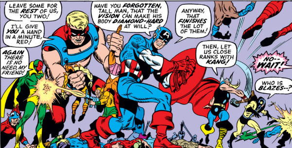
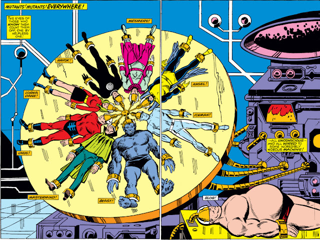
Artist Sal Buscema's work would be fairly easy to caricature--many of his characters' facial expressions are reoccurring, as are body gestures and fight poses. There will rarely be a day when you can't identify artwork by this otherwise talented and prolific artist; I think the closest you'll come to indecisiveness is when artist Ron Frenz (whose work, incidentally, Buscema has often inked) has mimicked him closely.
Buscema, in his later work at Marvel, had a tendency to draw smaller panels than his peers--at least, they seemed to look so because he would draw the characters in them somewhat smaller than usual. That became more noticeable in his work on Incredible Hulk, or in The Defenders where the Hulk was featured. The Hulk, as drawn by Buscema, was very "compact" in stature:
In fact, as you can see, everything looks crammed into a panel, no matter how large its size. That's certainly not to discount Buscema's storytelling ability, nor his dynamic style. Even as a fill-in artist, Buscema's clean, recognizable work is preferable to many other artists an editor might choose.
Nevertheless, it's understandable that when discussing double-page artwork featured in Marvel comics, the last contributor in this respect who you would expect to come to mind would be Sal Buscema. Yet there have been some fine examples. There was that beautiful rendering of the Zodiac cartel (minus Scorpio) from The Avengers--a display of nearly the full complement that, to my knowledge, has only been duplicated once (by artist Bob Brown, this time with Gemini missing):
You've gotta give props to twelve otherwise respectable crime bosses who slip away from their underlings now and then to dress up in costume as a bunch of Zodiac signs. You never saw stuff like this on The Sopranos.
Over in The Defenders, which Buscema drew for over forty issues, Dr. Strange and the Sub-Mariner are fruitlessly searching for the Silver Surfer, who they believe has betrayed them. But in this spectacular two-page spread, Buscema shows the Surfer, instead, finding them:
By the way, in case you thought the Sub-Mariner was thrilled with the idea of being hoisted into the air like a Hefty bag:
Buscema is truly a versatile artist in terms of presentation, able to craft action-filled panels as well as more dramatic scenes meant to have an impact. As you saw with The Defenders, a double-page spread can be perfectly suited to conveying dramatic impact, at the right time. Have a look at this pivotal scene from The Avengers, where Kang the Conqueror has imperiously brought the Avengers into his own century in order to involve them in a contest with himself and the Grandmaster:
Of course, sometimes you can't expect the Avengers to be any more receptive than Namor:
Still, as was the case with other artists who attempted them, Buscema's two-page spreads didn't always measure up to the space. I remember the one he did in Giant-Size Defenders #1, a "pin-up" of the original team members (with the Surfer and Valkyrie). It was a bare-bones display that could have just as well fit a half-page panel--it wasn't particularly memorable or dynamic, used more space than it really needed, and didn't seem to appear like a great deal of thought went into it. There was also this two-pager from Captain America:
The issue's script gave this spread a good deal of fanfare--but as you can see, it's something of a letdown. There's far less here than merits such a use of space. I suppose it's possible that's why Buscema never did a great deal of two-page artwork--perhaps the larger area simply didn't suit his style.
But on that note, there was this example--a double-page drawing of the Defenders (with assorted guest-stars), battling the Sons of the Serpent, which in one picture is about as accurate a representation of Buscema's style as you could ask for:
A very busy picture, with all characters present and accounted for--but it's a Sal Buscema battle scene no more distinctive from any of his other art in this respect. In this instance, it serves to bring a quick wrap-up to the story--where writer Steve Gerber perhaps intends for the action to take a back seat to the drama taking place in terms of Kyle Richmond unknowingly financing the extremist Sons of the Serpent group.
There were other instances of double-page spreads by Buscema not included here, but I think you may have seen all there really is to see. That said, I cannot stress enough Buscema's overall contribution to Marvel and the comics industry. A book published in 2010 by Jim Amash and Eric Nolen-Weathington, which may well be the definitive work on Buscema, labelled him as "comics' fast & furious artist," which pretty much hits the nail on the head. And at 76, the man is still inking pages for Marvel. Whatever size page his work graces, this workhorse has earned his accolades and then some.


2 comments:
That Avengers spread with Kang is superb; so much storytelling within one image. I find that I can pretty much 'read' any random Sal Buscema page without the words, and that is a credit to Sal's staging and the body language/hightened emotion he imbues the charaters with.
Must look up that book on him.
Someday I'll have to establish a "wish list" at some retail site somewhere, because there's a lot of comics stuff I can easily pad it with--the Buscema book included! :)
Post a Comment