Friday, January 31, 2020

Symbolic Splash Pages: Avengers/X-Men


Wrapping up our look at symbolic splash pages which were featured in Marvel books from the early 1960s to the mid-'70s, we come to two team books which separately may not have offered much in this area but, combined, "assemble" an interesting collection to close out this series in the PPC.

In the case of the Avengers, like myself you may find their set of symbolic splash pages rather a mixed bag in terms of creativity and quality--a far cry from Steve Ditko's offerings in Amazing Spider-Man, though, in all fairness, we're talking about apples and oranges in terms of not only the characters but how the two books were being presented to the reader. It also has to be said that, unlike Fantastic Four, which had its own share of SSPs, The Avengers and X-Men were often in a state of flux with not only their artist teams but more importantly their direction, and as a result struggled to find their footing (and their readership)--whereas the FF and Spider-Man had the benefit of stability, which perhaps helped contribute to the look of their respective SSPs. Aside from the X-Men's color-coordinated uniforms, which were consistent for much of the title's run before it went on hiatus, neither The Avengers nor X-Men in their early days generated the sense of familiarity that a symbolic splash page could take advantage of.

Some Avengers/X-Men pages which did stand out for me in certain respects were the following (and your mileage may vary):


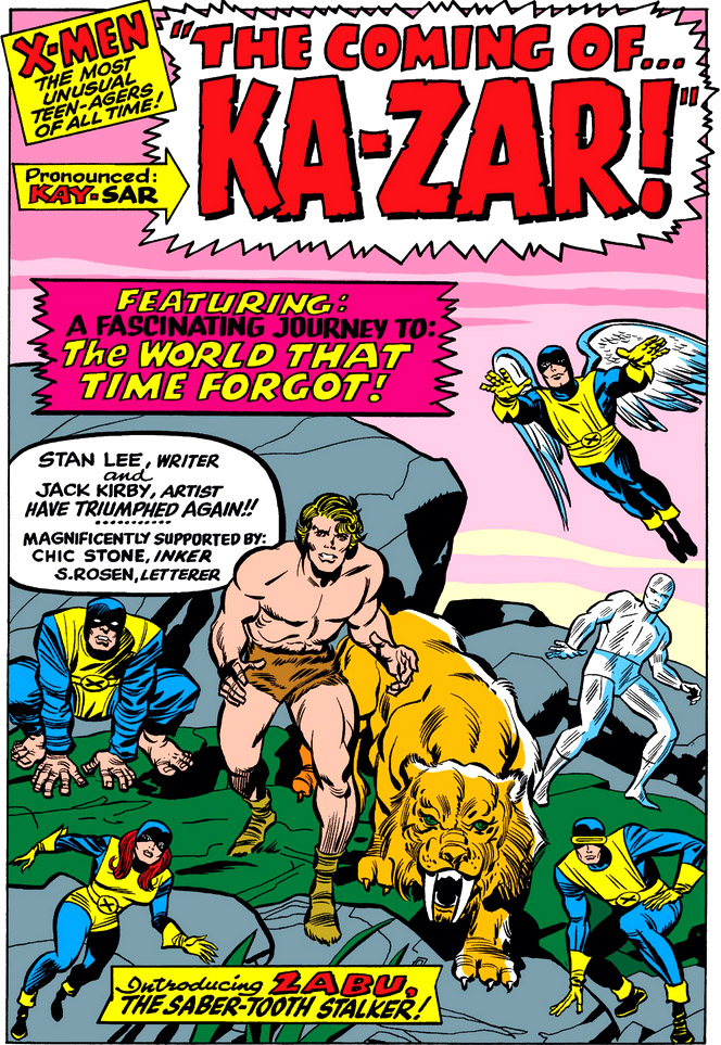
As opposed to the Avengers, however, I can't say there's a single page from the X-Men group that I would mark as disappointing in the context of our main theme here. (You'll note that the page for X-Men #26 even takes a moment to explain what constitutes a "symbolic splash.")  All were nicely presented and piqued my interest while doing a good job of nudging me to continue to the story within. (Though I had second thoughts on the X-Men page featuring Lucifer--apparently we should be feeling tense or apprehensive about that device he's hoisting over his head, but the page does little to nothing in getting us there.) But as for the Avengers, there were some exceptions for me, followed by some brief takeaways on each.


  • Avengers #9: If we didn't know better, we might think that Zemo was Wonder Man with all the fanfare the character receives in the captions.  Besides the Avengers, wouldn't you have assumed that the only other figure here would be the same character whose name is being announced like thunder?  And doesn't Cap's dialog seem conspicuously added to avoid such confusion?
  • Avengers #13: The Avengers certainly don't look like they're trapped in a castle--it's really the charge of treason that's the main draw here.  For maximum effect, let the title reflect the shocking image we're looking at.  The machinations of Count Nefaria, a new character we know nothing about, can wait for the story to elaborate on.
  • Avengers #s 17-18: So the new Avengers lineup is already reduced to fighting a mythical monster--is that what they or we signed up for, or isn't there more to this story? As for the Commissar, as a foe for the Avengers he appears at first glance a poor substitute for the Mandarin.
  • Avengers #61: Granted, it's a John Buscema two-page spread; but unlike a similar opening rendered by Gene Colan, Buscema's is a symbolic representation and isn't directly relevant to the succeeding page. With apologies to Surtur, Ymir, Mr. Buscema, and letterer Sam Rosen, we need a little more than a "fold-out" title to better represent the events we'll be reading about.

Hopefully you've enjoyed this brief series.  Coming up at a later date, the PPC is already rounding up symbolic splash pages from other titles for a follow-up presentation--and if you have some examples of your own from the titles which were featured but didn't appear here, feel free to point them out. We're all ears (and eyes)!

Wednesday, January 29, 2020

Symbolic Splash Pages: Spider-Man


We're in the middle of a week-long look at Marvel's symbolic splash pages which were in limited use during the early 1960s to shortly after the mid-'70s--the cleverly put-together Page One which was styled to let the reader know at a glance what obstacles or dangers were threatening our hero(es) but a representation not directly woven into the story. After starting off with the pages from Fantastic Four, we now move on to a title which was somewhat more prolific in its usage of symbolic splash pages--even beginning with the character's first appearance.


As we know, artist Steve Ditko's work here in Amazing Fantasy marks an appearance which helped to launch Spider-Man into his own series in short order. It's clear from the start (and certainly from writer Stan Lee's narrative) that Spider-Man's ordeals with public rejection and personal ridicule are intended to be the "hook" that sets him apart for those who might be expecting a costumed hero to be cheered and admired in the public arena--a point driven home in the splash page of his new series' first issue.


(Our hero is looking a little spindly here, Mr. Ditko.)


With the bizarre foes that Spider-Man would face from this point on--in addition to the woes of Peter Parker, a character whose popularity with readers appeared to be linked hand-in-hand with that of Spider-Man himself--Ditko seemed to excel in the presentation aspect of a symbolic splash page, a format that served to lay all the cards on the table for the kind of story one could expect to find inside. Grouped together, they form an excellent album of Ditko's unique style, in combination with what could be considered his signature character* for Marvel.


*Though a certain Master of the Mystic Arts might beg to differ!

Ditko's symbolic splash pages would begin to taper off around mid-1965, with his departure from the series taking place a year later. Even so, his creativity in this area continued to tantalize.


And there were of course his pages that opened the 1964-65 annuals.


With Ditko's exit, artists John Romita and Gil Kane unfortunately provided only sparse offerings as the book pivoted to a more dramatic format, a few of which mixed some of the elements of the traditional symbolic splash page though seamlessly leading directly into the story:


And how about this early Spidey effort by Ross Andru which owes its existence to circumstance--leading off a replacement story for a deadline snag involving Romita, but instead shelved and used in an issue of Marvel Super-Heroes from May of 1968 (though some of you may recall its appearance in the first Marvel Treasury Edition from 1974):


(Looks like voodoo from where I'm sitting, Mr. Lee.)


Finally, these nicely-handled efforts from Romita which masqueraded as symbolic splash pages but indulged in some amusing sleight of hand with the reader.


Ver-ry funny, gentlemen. Well played. :)

NEXT:

Monday, January 27, 2020

Symbolic Splash Pages: Fantastic Four


When I think of the symbolic splash pages that Marvel titles used on occasion beginning in the early 1960s, I seem to recall their mention in letters pages, as the page's letter-answering "armadillo" would try to explain to a perplexed reader that the page only depicts an out-of-context representation of events that one would find further within the story. To be honest, during those years I'd never given much thought to that opening page, taken in with little more than a glance on my part since to linger would keep me from diving into the issue's story; but in preparing a few of these pages for a series of posts this week, and finding myself giving them more than a cursory look this time around, in a way it's almost as if I'm seeing them for the first time.

Taking more time to explore them, and becoming more appreciative of them in the process, I found that it was helpful to look at them from the point of view of the artist--tasked not only with choosing the page's concept, but also adding his own flair for assembling everything and everyone in a way that was sure to pique the reader's interest and fuel their anticipation. Page One was, after all, the first page that a store browser was likely to see upon flipping the cover open for a quick look, and thus was the hook that would hopefully tempt the buyer sufficiently to take the issue home for a read (after stopping by the register on their rush out the door to pay for it, of course).

There are certain criteria for what comprises a symbolic splash page, but in essence it was a full-page "profile" of what you'd find within, though often skewing physical laws in its portrayal. As for specifics on their makeup, writer Gerry Conway had his own interpretation:


As is the case here, many SSPs feature a confrontation between hero(es) and villain(s), well before the story brings us to it--while others take a different approach, and simply present a montage of the characters involved. These pages could of course be found in a number of titles, rather than confined to just a few; but to provide a good sampling of them here, the PPC will narrow our focus a bit and spotlight the pages which appeared in Marvel's team books, as well as those appearing in what was arguably the company's most successful solo title at the time. Beyond that, do take the opportunity to discover (or rediscover) them for yourselves in your favorite titles if time permits.

Since the characters of Fantastic Four have already brought us this far, it seems fitting for them to lead the charge here, though you shouldn't take that as an indication that artist Jack Kirby and others chose this sort of page often; in fact, usage of the SSP began to taper off shortly after the mid-1970s, giving way to a more dramatic opening page that connected directly to the story that followed. Nevertheless, I hope you'll enjoy this retrospect of this style of story presentation as much as I did.

And you just know who insisted on being prominently displayed first thing.


Friday, January 24, 2020

Matrix Eight--Supplier of the Sinister


Or: "How To Harness The Hulk"


Shortly after the brief Roger Stern/John Byrne period on Captain America had run its course, what appears to be an inventory story was published--one which no doubt benefited from its eye-catching cover.


It's easy enough to connect the dots on the presumed scheduling difficulties associated with getting this issue prepped for publication--one sure tip-off being that it consists of just seventeen pages of story, followed by five pages of filler material from Marvel's old parody mag, Not Brand Echh (three of which were shamelessly tied to issue #255). There are also the story's credits, which are somewhat conspicuous in their diversity. This would be the only issue of Captain America penciled by Golden Age British-American artist Lee Elias, who worked on a handful of Marvel titles (most notably The Human Fly) before retiring from comics about a year after this story's publication. There were similar circumstances for scripter Mike Barr, having written only one other tale for the title (aside from a What If tale featuring the character); like Elias, he mainly contributed sparse work on second-string titles such as Solo Avengers, Marvel Preview, Marvel Spotlight, et al. And as for inking chores, the nomenclature of "M. Hands," shorthand for a number of inkers pitching in on pages or even individual panels in order to finish the issue, speaks for itself.

None of which is an indication that this story is necessarily a bad one; I came away from it, instead, feeling it was sub-par, and your own mileage may vary. The one thing we may likely all agree on is that it leaves one with the impression that it was shelved for a rainy day, which in 1981 cost us 50¢ to find out--a sum that admittedly elicits little more than a shrug in 2020, but one can only shudder at the thought that inventory stories might be appearing in store racks even today, at around $5 a pop.

For Cap, the story starts off quite nicely, actually, as a makes a yearly pilgrimage to northern England, to overlook the site where his friend and former partner, Bucky Barnes, was caught in an explosion over the ocean that took his life. But from the look of things, on this year he may not be afforded the solitude that such reflection calls for.


Wednesday, January 22, 2020

Birth Of An X-Man!


Once the decision was made to admit Rogue to the X-Men on a probationary basis--over the strong objections of none other than the X-Men themselves--there was nowhere to go but up for the young mutant, who had come to Charles Xavier seeking help not only in controlling her power to absorb the abilities and memories of those she came into physical contact with, but also in dealing with the anguish she suffers from wrestling with the memories of one woman in particular. Prior to this point, Rogue was persona non grata with those unfortunate enough to cross her path--with the Avengers, for instance, who barely survived her ambush when she fought with the Brotherhood of Evil Mutants... and certainly with the X-Men, whose friend Carol Danvers was also ambushed and suffered the loss of her abilities as Ms. Marvel as a result, as well as any feelings of familiarity with what memories were left to her.

And so when the X-Men arrive in Japan to attend the wedding of Wolverine and Mariko Yashida, Wolverine--who had history with Carol and knew her the best of all the group--has already made his decision of how welcome he plans to make her.


And yet, judging by the cover of the following issue, writer Chris Claremont has made an interesting decision regarding the development of these two characters--the results of which may surprise you, and them.


Monday, January 20, 2020

The Battle of Heaven's Hand!


At the tail end of 1981, Tony Stark's personal life was in a tailspin! We'd better get started patching it up, eh?

Here's the gist:

  • Stark's girlfriend, bodyguard/P.I. Bethany Cabe, suddenly takes off on a mysterious quest to Europe. Soon after, Stark comes across a newspaper article which reports she's been arrested behind the Iron Curtain on charges of espionage.
  • Unknown to Stark, Bethany has a husband--Alexander van Tilburg, formerly West Germany's ambassador to the U.S. and presumed dead until recently. In actuality, the Russian KBG had captured him and faked his death in order to interrogate him to gain data on N.A.T.O.'s long-term espionage sleeper agents stationed in Europe. When the use of drugs failed, the Russians decided to use Bethany as a lever; to that end, they leaked word that her husband was still alive as a way to lure her to his side.
  • Stark finds out through social and political contacts that Bethany is being held in Der Hand von Himmel ("Heaven's Hand"), a top secret security/research complex in East Germany.
  • When diplomatic outreach to the international community fails, Stark decides to use his new stealth armor to infiltrate and gain intelligence on the installation, barely making it out in one piece.
  • Stark and his pilot and friend, James Rhodes, mount a rescue mission using the data gathered by Iron Man's previous stealth mission.
  • Once inside the installation, Stark locates Beth and discovers to his surprise that she had set up her own capture in order to stage an attack with a band of mercenaries to create a diversion so that she could break her husband out. You can guess which news comes as the greater surprise to Stark.
  • With Stark inadvertently interrupting her plan, Beth is forced to reveal her knowledge that Stark and Iron Man are one and the same in order to implore Stark to suit up and assist, knowing that Iron Man is now the only chance for everyone to escape alive.

It's admittedly a lot for Stark to take in all at once--but what do you think he's going to do?

Under the circumstances, the only thing he can!


All things considered, this rescue's going off without any significant hitch so far, thanks to the presence of Iron Man. But the East Germans have another guest at Heaven's Hand--one whose thirst for revenge appears to outweigh the need for secrecy in regard to his benefactors, and whose power brings down Iron Man with a single strike.


Well, Mr. Stark, it was either facing the Living Laser or a love triangle, sir.
Count your blessings.

Friday, January 17, 2020

A Bargain At A Buck


With rare exception, comics issues which pepper their covers with tidbits of scenes from inside, along with captions that exclaim that this issue is the one you can't miss (or words to that effect), often do prove to be enjoyable since the promotional material is taking the stance that the issue has a little something for everyone--or, more loosely translated, there's bound to be something here that you'll like. While that may indeed be the case at times, one could regard such a cover as attempting to put the best face on a story which was unfortunately mostly devoid of (to put it bluntly) a story, depending on your definition of the word. You and I could probably name three or four such issues off the top of our respective heads which fit that description; yet many of them work on some level, if only as a harmless change-of-pace story that allows the book and its characters to catch their figurative breath.

The Mighty Thor issue we're about to take a look at wasn't specifically chosen to explore this theme; rather, in a way it flagged itself because of the way it backpeddles its marketing with a tongue-in-cheek disclaimer:


Which in a way gives the impression that the issue is patting itself on the back for not even trying to give you the content you're getting for your buck--but that's a Marvel hallmark if ever there was one.

In this instance, you might find yourself more than willing to give the story a pass for its heavier focus on the Wrecking Crew and Code: Blue, since the book has up until now amply fulfilled its quota of engaging Thor/Asgardian adventure (e.g., the realm has just prevailed in a clash with Ymir and Surtur, neither of which can be considered lightweights). That said, you might as well know going in that, thanks to a two-page comic/ad promoting the TurboGrafx Splatterhouse game, and a five-page backup story featuring Earth-Lord of Earth Force, that leaves just eleven pages of Thor for readers who picked up this issue expecting to see a Thor issue that "has it all." (And you shouldn't expect the Sif vs. Leir battle to make up the difference.)