Saturday, June 7, 2014
Fill My Eyes With That Double Vision
Most of us are used to seeing crossover comics from time to time, where stories continue to other titles published in the same month or even spanning several months. (I'm perhaps being too diplomatic--at times, particularly in crossover "events," it can fell like we're inundated with them!) But there are times when even their covers get into the spirit--and, in addition to plastering the same "event" banner on the covers that are crossing over, their artists will coordinate and produce covers that actually resemble each other. Combined with a little optical illusion, they can give an interesting look to the sales rack for that month, assuming the proprietor of the comics shop remembered to stack them next to each other.
For example, there was that time when the Beyonder turned an entire building in New York to gold, and two Spider-Man titles continued the story between them:
It wasn't a bad little story, focusing on the corruption taking place vis-à-vis the government and the Kingpin, but also the corruption of Spider-Man himself, who out of frustration decided to pocket his piece of the pie. John Byrne, who drew the covers to the issues, decided to take a panoramic approach:
It didn't quite work out when attempting to join the covers together, as some parts would match with their counterparts but not others. E.g., if you lined up the large Spider-Man figures, the smaller ones would shift out of place, with the building itself reacting the same way. But it was still a very cool look--and, placed far enough apart on the sales rack, you'd still get the desired effect, as you can see. (Though if they were on a spinner rack, all bets were off!
Byrne and fellow penciller Kerry Gammill teamed up on covers for the Fantastic Four/Avengers crossover dealing with the Skrulls losing their shape-changing ability:
Byrne, who pencilled both issues, is inked by a different finisher in each--and the scene where the two teams confront each other plays out the same, with each initially believing the other to be Skrulls:
Again, fairly good issues which deal with the Skrull civil war which broke out after Galactus had consumed their throne world. You could only read one, perhaps, to understand what's going on--but each takes a different approach, and the stories don't really "resemble" each other until the two teams meet near the story's climax (note again the differences in styles between inkers Joe Sinnott and Kyle Baker, the latter doing a fair job of finishing over Byrne's breakdowns).
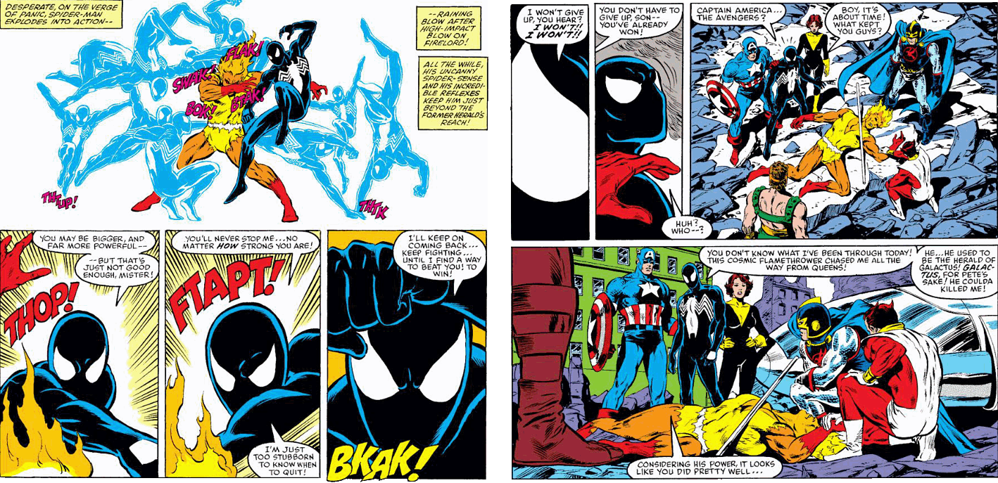
Finally, these covers of both Avengers and Amazing Spider-Man offer no such coordinated effort on their covers, but both stories factor in Spider-Man battling it out with Firelord:
The segment in the Avengers story is rendered by John Buscema and Tom Palmer, and wraps up the fight nicely. In the Spidey book, Ron Frenz and Bob McLeod devote more space to the fight, but essentially close on the same note:
I don't know if Buscema and Frenz gave any thought to coordinating their covers--but the effect could probably have been achieved (as well as providing a cover more true to the actual story) by putting Spider-Man front-and-center, profiled with Firelord while trading punches, rather than giving him a somewhat cameo appearance by having him swinging in behind the Avengers. After the fight Spidey puts up, I don't think the Avengers have any call to be hogging the limelight here, do you?
Subscribe to:
Post Comments (Atom)


2 comments:
As John Buscema is truly the Michelangelo of comics, I have to say that the effort on the ASM issue is a far superior cover to the postured Firelord on the Avengers. That Spidey cover is one of my favorites of that era.
Doug
Very much in agreement with you, Douglas.
Post a Comment