You have our friend Doug at Bronze Age Babies to thank for the inspiration for this post--specifically, a remark he made in his review of Avengers #56 about the nice visual by letterer Sam Rosen of the story's title being framed within the shape of a castle bridge:
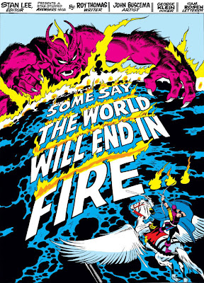
It got me thinking about other instances where Rosen and other letterers have occasionally forsaken banners and instead weaved the title wording into scenery or structures on the splash page. Many of them are beautifully done, and they help to kick off the story and add to the drama by emphasizing the title with the story's own elements, thereby giving both greater impact.
And since the Avengers kicked off this post, it seems only fitting that they lead the way to more such examples of these beautifully lettered title pages.
Thor's not the only person who can swing a weapon in an Avengers story, as the Swordsman shows us when he announces himself by smashing through a billboard, as rendered by Gene Colan:
And speaking of announcements, look how cleverly the title to issue #60 becomes a part of the invitation heralding the wedding between Yellowjacket and the Wasp:
Rosen had a little more fun with stone, though, when the Vision became an Avenger:
Of course, a neon sign on a building is just asking to double as a story's title:
Letterer Jim Novak demonstrates the advantage of signs further in the 300th issue of Incredible Hulk. First, using a teaser on the first page:
Followed up by a two-page spread that presents the title fully:
While Jean Izzo combines her talents with Colan to tackle nothing less than the marquee in Times Square, which serves as the backdrop to the challenge that Dr. Strange hurls to his enemy, Nightmare.
Back in the Avengers, artist John Buscema offers his own two-page opener, giving Rosen plenty of room to ply his craft:
And since there was a little snow left over, the next issue doesn't let it go to waste:
One of my favorite title pages where the wording blends into the art is another Rosen job, as a dripping-wet Triton arrives in New York and the water trickles off to form the story's title:
Rosen is equally adept over in X-Men, again joining forces with artist Neal Adams:
Letterer Dave Hunt also added a nice touch to Dave Cockrum's opening page in the issue which follows the death of Thunderbird:
But it would be letterer Tom Orzechowski who takes this ball in X-Men and runs with it, giving us several fine instances which brought new meaning to the phrase, "title page":
In one or two of these, it could very possibly be the penciller who's incorporated the lettering into the actual scene--but the letterers' praises are sung so infrequently that if I've erred in crediting the work, I'm happy to err in their favor.


7 comments:
Sometimes, the lettering can almost make or break a story (as far as the reader's enjoyment goes) - although it must be admitted that I'm a tad biased in that department.
I've certainly read stories where the lettering turned out to be a poor fit for the story--for instance, in Defenders #10, I thought Orzechowski's lettering fell short of the action and was just flat-out odd in several places. Hell of an issue to drop the ball on lettering.
You're welcome, Comicsfan! But you really took this ball and ran with it -- great post!!
Two covers that I've always found to be really cool are Neal Adams' rejected cover to X-Men #56 (with the Living Monolith originally holding the X-Men logo over his head, with the team chained to the letters) -- Stan thought obscuring the lettering would be bad for sales! And, the cover to Batman #194 with Blockbuster smashing the cover's logo.
Yep -- incorporating the lettering either into the very artwork or into the mood of the story to follow is an interesting concept and craft.
Great topic!
Doug
References:
X-Men - http://4.bp.blogspot.com/-2zP9kx-N_Y0/T2nsyaswlPI/AAAAAAAAAJ8/cSV2ghEa0-U/s640/XM+056_ca_HK.jpg
Batman - http://images.comiccollectorlive.com/covers/b6f/b6f017d1-7d5e-4dde-a034-410439c8e59a.jpg
I think John Byrne probably found the right balance with what Adams was trying to do--there's quite a lot to like about the Adams cover, though I can see Stan Lee's point about it.
You know, now that you mention it, cover title manipulation would be an interesting topic, too--maybe you and your partner in crime can do it justice sometime, since you've already started the ball rolling. :)
Wow, great post. I'll have to start paying more attention to the splash pages!
The Fire and Ice Avengers splash page is epic ! Its one of my favorite Avengers comics of all time !
If Avengers 93 is any indication (the famous "This Beachhead Earth," for which Neal Adams's pencil art is readily available), the penciller roughs in the details of the splash page, and the letterer refines it. Of course, who better to do this than Sam Rosen or Artie Simek?
Post a Comment