
This street corner isn't safe no matter HOW you look at it:
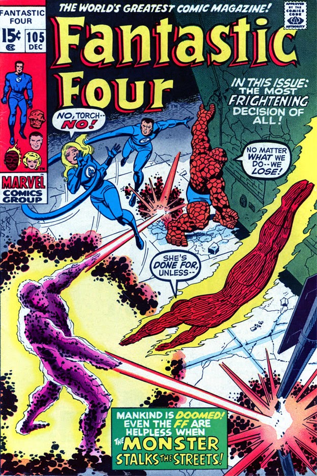

In this pair-up featuring the cover of Fantastic Four #105 and its later rendering in the FF reprint mag, Marvel's Greatest Comics, there's a whole lotta shiftin' goin' on (with apologies to Jerry Lee Lewis)--as well as a little bit o' squeezin'. As in many of these refits for MGC, it looks like the squeezin' is bein'--er, being done to accommodate the additional wording at the top. The FF logo itself doesn't seem to be a problem in that regard--the original wording is roughly about the same size as the newer logo which began appearing on FF covers in early 1972, even taking into account the warped effect given to the lettering; but it's being shoved down by both the MGC presentation wording as well as the Marvel banner at the top. You'd think the FF themselves would be more prominently featured than all of that, wouldn't you?
What else jumps out at us? Angles, angles, angles. Our poor sign post being blasted by the Monster fares somewhat better, though it can't completely escape the tilt to the right that engulfs the entire team, including that building the Thing is struggling to... struggling to... frankly, it's hard to tell here why he's struggling with it. That's a really odd cover pose to put him in, isn't it? The story makes it clear that he's trying to keep the building from crumbling--but on both of these covers, he seems to be trying to lift the darned thing--maybe to topple it onto the Monster?
As for the squeezing, nobody escapes unscathed, as all of the FF are reduced in size to make room for their own cover lettering about to crush them. The Monster looks to be about the same height as he was originally, with his arms and blasts being repositioned a bit and his crackle effect altered. We also see that mankind is still doomed, though the size of the caption box is doomed to be reduced in size as well, thanks to that dreaded UPC symbol--and, sadly, "the most frightening decision of all" caption was too frightening to stay.
That leaves the little things--for instance, there's less of the building the Thing is struggling with. The upper part of the building looked to be toppling on the original cover, and having the same appearance on the MGC cover wouldn't have been a hindrance to all of the additional titling; but with the angle adjustment the building receives on the newer cover, perhaps the toppling effect was deemed unrealistic. Coloring has also been altered in places, with the Monster being the obvious change--but his blasts, the Thing, costumes, and even the Torch's flame have all received color enhancing, with Johnny also getting a little more flame detailing across his body.
Also: Is it my imagination, or does the Monster look more alarmed? With all the angle shifting, maybe he's worried about falling down the block?
3 comments:
I've always been curious about the reasoning behind the FF masthead on the left - " It's a new decade so let's have a new masthead,but we won't actually design a new one just make the old one look thicker and chunkier". If you keep reading Kid Robson's Crivens blog you'll soon see the covers of FF #84-109 redrawn in 'landscape' fashion for Marvel UK's The Titans weekly :)
Marvel's Greatest Comics, like the other numerous reprint mags, were a godsend, for those of us who didn't have the spare coin to pick up the originals. I've got some originals, but the majority of the first 100-120 issues of the F.F. run in my collection are reprints.
I've often scratched my head about the reworking of the covers. If the original wasn't too hot, I could see it, they had to jazz it up to sell it on the spinner racks. But I really preferred the Kirby covers. Some of the reworks, Gil Kane, Sal Buscema, Jim Starlin, were pretty cool, though.
It's an interesting point, about the different title with more words determining a different layout for the cover. That hadn't occurred to me. M.P.
Colin, if the lettering style of the newer FF masthead resembled that of the original--upper/lower case with the crown tips to the letters--I think you might have a legitimate beef with the redesign. But the newer style does seem noticeably different to me, if unimaginative. I might have emphasized a word like "Fantastic" with a more dynamic appearance that took advantage of the word's meaning, and really given the masthead a different (and hopefully more exciting) look. The newer masthead looks, well, newer. I just think it could have gone a little further to make an impression.
M.P., yes, I really think one or two more lines of words at the top might have resulted in the Torch taking on the Monster by himself! ;)
Post a Comment