
While one of the pleasures of browsing a comic book store (or even a comic book display in a store's book or magazine section) is letting your eye wander across those eye-catching covers that are doing their best to entice you to take that issue home, the experience becomes even more of a reason to kill some time when the cover artist is being innovative not only with the character(s) portrayed but also with other elements of the overall image. (Bill Sienkiewicz's work might be one example that would come to mind in that respect.) And so having recently been preoccupied looking through various Spider-Man titles, I thought I'd pick out a few such issues to share which were especially eye-catching to me, where even the issue's masthead at times became collateral damage.
Let's start with what may be a surprising choice to some of you--artist/writer Ed Hannigan, whose work you may remember from The Defenders but whose covers from Amazing Spider-Man and Peter Parker, The Spectacular Spider-Man in the early 1980s were at times groundbreaking in terms of bringing more artistry to a cover image than what you were expecting.

Co-creator of Cloak & Dagger, Hannigan (with inker Al Milgrom) presents a suitably eerie scene of the pair in their second appearance, thanks in part to the equally eerie use of the spider-signal (even that poor cat is scurrying for cover), while also adding dimension to the image by slanting the cover's masthead, banner, and corner box. Yet the pair of artists really go to town on the Electro cover, and not just with the (pardon the word) spectacular use of the masthead--just look at all the nice touches throughout, including the not-subtle-at-all plug for Marvel's bimonthly anthology magazine Epic Illustrated, at that point in time in its second year of publication.
Yet Hannigan would have more harsh plans for Spider-Man's masthead in three other offerings:


It's to Stilt-Man's credit that he's often so well-armed and doesn't depend solely on his stilt attachments to overcome obstacles or threats to his plans. Obviously whatever he's packing here was enough for Spider-Man--but aside from blasting his masthead to smithereens, what could he be firing at in the sky besides clouds? (I'm guessing he's just in a celebratory mood.) As for the Speed Demon, he's clearly giving Spider-Man, his masthead, and even his corner box a *ahem* "run" for his money, heh heh--while the shredding of the masthead by "Dr. Octopus" may just be panic on the character's part, if it's the story I'm thinking of.

We would see others follow Milgrom's lead in the first example with their own swings at the cover masthead only a few months later:

And of course we see mostly Fred Hembeck's handiwork on the other cover (admittedly thrown in because I'm a Hembeck fan), with Milgrom providing the peel-back effect with Spider-Man and the Black Cat.
Stunning use of not only masthead placement but also cover design, courtesy of artist Marko Djurdjević, is indicated with paintings of four Amazing Spider-Man covers from 2010 that, with two prior issue covers, would form a six-issue panoramic display (akin to what we saw in wraparound covers from time to time).

The digital work of Adi Granov from the previous year also demonstrates that when it comes to boundaries, even a masthead must give way when there's a villain involved.

In 1996, "Our Pal" Sal Buscema was demonstrating he was still a wiz at cover design just a few months after celebrating his 60th birthday. (Darn that obtrusive UPC symbol!)

(And if any of you can recall when (and why!) Spidey began wearing his web shooters on the outside of his costume in the mid-'90s, I'd be much obliged.)

During the same time, Editor-In-Chief Joe Quesada, in part known for Marvel's "dead is dead" policy as well as his gradual restoration of issue numbers following his predecessor's reset of select titles to #1, proves his adeptness at comic art with two eye-catching examples of ASM covers:
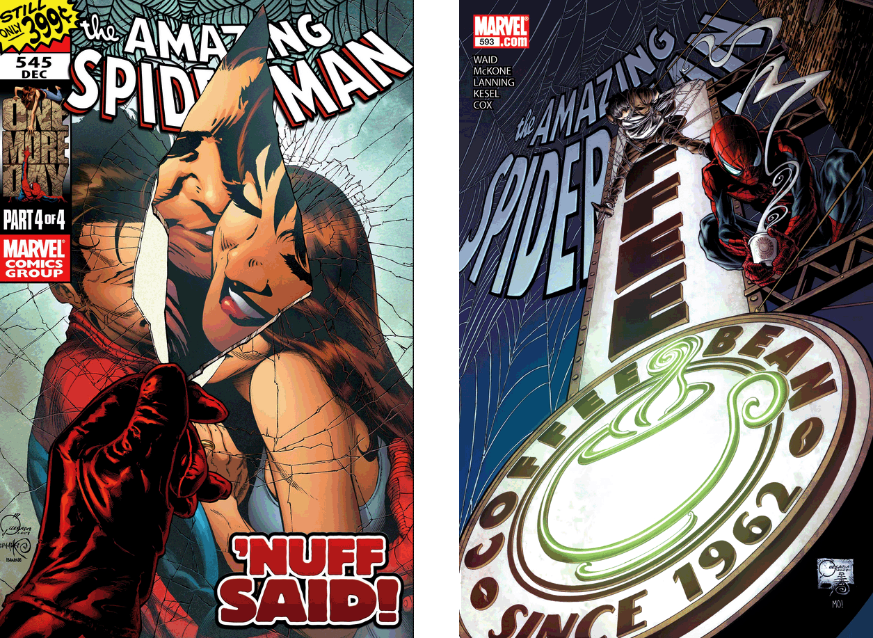
While the cover of issue 593 in my opinion isn't exactly enticing as far as selling the book's story, whatever it may be, it does hark back to the Coffee Bean, a cast-of-characters hangout that received its own pinup in the fourth ASM annual. And the perspective of the masthead as well as the other elements pictured have the cool effect of putting anyone on the sidewalk in the position of tilting their head up to see what's going on (and subsequently dropping their jaw).
And wrapping things up for us, it's hard to tell what artist Paolo Rivera intended to signify with Spider-Man's efforts in this 2011 cover:

Did Spider-Man land on the marquee, only to find the letters he'd attached himself to coming loose? Or is he attempting a little self-promotion? If the latter, we'd have to assume he was holding on to the marquee with his right hand--otherwise, the fall he'll take will pretty much tank whatever favorable word of mouth he was hoping for.
5 comments:
Those "extra-hot sauce" graphic designs are always a treat. Some in your presentation I haven't seen!
As to Spider-Man on the cinema marquee, well...the story within is a lovely standalone (relatively) tale that entirely revolves around movies and cinema. We are introduced to a tradition shared by Betty Brant and Peter Parker where the first Friday of every month is their "movie night". At home or at the cinema, it's a date they try to keep.
Of course, Spider-Man business gets in the way sometime. In this story, it's a rare indie foreign film showing at an art house theatre and Betty really wants to see it. Peter keeps postponing. The movie has a limited run and then it's gone, so Betty is getting impatient. She finally decides to go by herself.
The theatre is NOT in a good neighbourhood...
As I say, a solid story well worth a read!
Thanks, Murray, I'll be sure to give it a look sometime. (It also looks like it's part of the Spider-Island crossover event, which I believe I missed entirely.)
I have always loved those Hannigan covers, and I thought he always did a solid job on the interior pencils. I know he would often be mentioned in the comics press for his contributions, but he never seemed to become one of the fan favorites. To me, Hannigan is someone like Kerry Gammil - he's one of my favorite artists, but I don't think they got the fan recognition they deserved. But maybe I'm wrong.
As for the Sal Buscema covers, they remind how Sal really turned around his reputation from someone who was considered by many readers to be too "old" by the mid-eighties, and really adapted his pencils to become a solid mainstay of the nineties. He's still recognizably Sal, but he adapted to changing market conditions very well. I think Walt Simonson deserves a lot of credit for giving Sal penciling duties on Thor during his last issues of his run there. Sal hadn't quite changed his style too much then, but you could see him updating it.
Chris
An excellent point about Hannigan and Gammil, Chris. As for Buscema, I wasn't particularly enamored with the stiffness of his work on Thor, but his creative talent for laying out the plots he was given was evident, and he and Simonson produced some very good stories together.
Love it when artists have fun with the covers. I think my favourite here has to be the Cloak and Dagger one at the top.
"(And if any of you can recall when (and why!) Spidey began wearing his web shooters on the outside of his costume in the mid-'90s, I'd be much obliged.)"
Easy! It's not Peter Parker's costume, it's Ben Reilly's.
Post a Comment