Thursday, September 17, 2020
Lo! The Less-Sinister Lethal Legion!
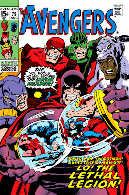
Having had occasion recently to come across a cover of an unpublished cover of The Avengers from 1970, I found myself asking the same question that usually comes to mind in such instances: What prompted the decision to re-do this cover? It's enjoyable to look at the original draft with a critical eye and put yourself in the position of the one tasked with clearing it--or not clearing it--for publication, while trying to determine what it was about the original rendering that wasn't deemed either suitable or marketable; but we can probably agree how much more interesting it would have been to have learned the actual reason straight from the source. A pity some sort of index of these types of cover substitutions was never collected in book form, complete with notes detailing just that. We could call it "How To Draw Comics Covers the Marvel Way!" :D
There are no doubt a number of such covers that for whatever reason didn't make the grade, a few of which can be found in the PPC as well as other fine comics blogs and forums. This particular Avengers cover certainly invites speculation, given that it so closely aligns with the final cover with only a few "touch-up" alterations of note.
A purely symbolic cover by artist John Buscema, of course, unless the Grim Reaper got his hands (was his scythe over in the corner?) on some of Henry Pym's shrinking gas and used it on the Avengers so they would fit in their hourglass prison. The reality is a little different:
We'll have to take the Reaper's word that his victims' gaseous prison is part of a large hourglass-shaped structure, since it resembles more of a clamped bell jar here (leaving writer Roy Thomas no choice but to account for Buscema's cover image by means of dialog)--a very cramp fit for the likes of Goliath, no doubt.
Some differences between the two covers are understandable at a glance. The hourglass itself has been altered and shifted in position somewhat, perhaps to make room for the caption at the lower right announcing the members and name of the Lethal Legion without it overlapping Quicksilver (who has enough to worry about as it is); it's also worth mentioning that in the original, at least part of the hourglass is transparent. Also, the final version of the, eh, legionnaires has them looking appropriately sinister, but noticeably less sinister than their draft counterparts. (For what it's worth, I found their appearance on the original much more eye-catching from a sales standpoint, so I can't help but be curious as to the reason why that aspect was subsequently toned down.)
In addition, the Man-Ape has been lowered a bit, presumably to prevent part of his headpiece from being obscured by the masthead (or vice versa, though there have been plenty of instances where part of a cover's masthead has been eclipsed by the artwork)--while the corner box has shuffled the Avengers around (though leaving Goliath as is) and adjusted those heads which were tilting. As for our captives, with the exception of Captain America and the Black Panther, their expressions and positioning have been altered, along with the loss of some detailing--both observations holding true for our villains, as well.
Since the basic cover concept has remained intact, it remains unclear what would warrant the decision to have Buscema make what amounts to cosmetic revisions. Do pipe in with your own thoughts on the subject if you have something to add--the Legion certainly won't mind, considering that either way they still have the Avengers where they want them! ;)
Subscribe to:
Post Comments (Atom)


8 comments:
Nobody drew sinister, thuggish faces quite like John Buscema :D
Beyond the reasons you cite, CF, I do note that the Power Man has been brought forward to stand in front of Laser. Swordsman has been turned more in profile to further display PM.
But then, maybe this shuffling isn't to display Power Man, but so the word balloon fits neatly on his chest without eclipsing too many bits and pieces?
Excellent observation about Power Man and the Laser, Murray. (Of course it's not surprising that those two would be jostling for position!)
On that cover, I think Big John had taken a page from Kirby by drawing villains with enormous sets of teeth. I remember in How to Draw Marvel Comics it said an artist should exaggerate the villains' features, but jeez, look at those choppers.
Remember how Kirby used to draw big burly villains like Ulik or the Sandman with these enormous mouths so it looked like they could swallow a cat whole? (which may have actually happened in Ulik's case)
Even more cerebral villains like Mole-Man and Maximus were sometimes drawn to look like they had just swallowed a piano.
M.P.
Don't look now, M.P., but you may have provided inspiration for a future post. ;)
A post like that would make me grin from ear to ear, C.F. ;)
M.P.
Am I the only one who prefers the pencilled version? It just looks more dynamic somehow.
The penciled art was lost in the mail en route to inker Tom Palmer. John re-penciled (and hastily inked) it from memory. Later, the first version was located.
Post a Comment