
When I think of the symbolic splash pages that Marvel titles used on occasion beginning in the early 1960s, I seem to recall their mention in letters pages, as the page's letter-answering "armadillo" would try to explain to a perplexed reader that the page only depicts an out-of-context representation of events that one would find further within the story. To be honest, during those years I'd never given much thought to that opening page, taken in with little more than a glance on my part since to linger would keep me from diving into the issue's story; but in preparing a few of these pages for a series of posts this week, and finding myself giving them more than a cursory look this time around, in a way it's almost as if I'm seeing them for the first time.
Taking more time to explore them, and becoming more appreciative of them in the process, I found that it was helpful to look at them from the point of view of the artist--tasked not only with choosing the page's concept, but also adding his own flair for assembling everything and everyone in a way that was sure to pique the reader's interest and fuel their anticipation. Page One was, after all, the first page that a store browser was likely to see upon flipping the cover open for a quick look, and thus was the hook that would hopefully tempt the buyer sufficiently to take the issue home for a read (after stopping by the register on their rush out the door to pay for it, of course).
There are certain criteria for what comprises a symbolic splash page, but in essence it was a full-page "profile" of what you'd find within, though often skewing physical laws in its portrayal. As for specifics on their makeup, writer Gerry Conway had his own interpretation:

As is the case here, many SSPs feature a confrontation between hero(es) and villain(s), well before the story brings us to it--while others take a different approach, and simply present a montage of the characters involved. These pages could of course be found in a number of titles, rather than confined to just a few; but to provide a good sampling of them here, the PPC will narrow our focus a bit and spotlight the pages which appeared in Marvel's team books, as well as those appearing in what was arguably the company's most successful solo title at the time. Beyond that, do take the opportunity to discover (or rediscover) them for yourselves in your favorite titles if time permits.
Since the characters of Fantastic Four have already brought us this far, it seems fitting for them to lead the charge here, though you shouldn't take that as an indication that artist Jack Kirby and others chose this sort of page often; in fact, usage of the SSP began to taper off shortly after the mid-1970s, giving way to a more dramatic opening page that connected directly to the story that followed. Nevertheless, I hope you'll enjoy this retrospect of this style of story presentation as much as I did.
And you just know who insisted on being prominently displayed first thing.

While Doom holds all the cards in this story, he also finds himself microscopic in size, though he manages to render the FF temporarily smaller than himself to facilitate their capture. Yet Kirby's image is a model of simplicity, giving the gist of the threat to both Ant-Man and the FF without having to go into detail--just by supplying the familiar image of a microscope, which doesn't appear at all in the story.
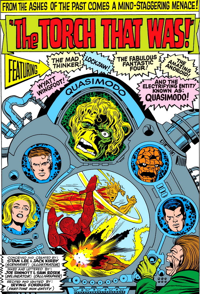
And then there were the many instances of the FF's floating heads, which presumably allowed the four members to be featured on these pages when available space wouldn't have accommodated them in full form (a situation which a number of the book's covers had to deal with, as well). Incredibly, 50% of the FF SSPs fell into this category.


In instances where the FF were present in more than head only, it served to heighten the danger by having the threat loom over them, as was the case with the Doom micro-world page. Of course, having Doom and our heroes loom over all of Manhattan may be stretching even symbolism too far!


The last FF SSP I remember seeing appeared in the FF's 1977 annual and was rendered by Bob Hall and Bob Wiacek, where you can't help but wonder why the Thing is being given special treatment.

A surprisingly limited selection for Marvel's flagship title, to be sure, though I put the brakes on after the first 100 issues--but if there are others which come to mind for you, give a shout and we'll include them (along with a tip of the hat to the intrepid sleuth who uncovered them). :)
NEXT:
5 comments:
I'd call it the "Second Cover Syndrome". I never understood what these pages were supposed to accomplish. It's like seeing a preview before the movie I've already paid to see
DC did it all the time in the Silver Age too. Three or so Superman stories in one issue, but each five page tale had to have a huge splash panel teasing us what was about to happen in the story. Quite wasting "real estate" and get to the action!
Nowadays comics often have a "variant cover edition" with an alternative cover (or covers) which can be better than the official cover. Those splash pages were like an early version of the variant cover.
"You can't help but wonder why the Thing is being given special treatment."
Personally Comicsfan, I wondered why they didn't give the Thing special treatment more often! Ben was by far the most entertaining of the FF.
Somewhat surprised the symbolic splash needed any explanation in the letters pages - even as a young child, I didn't ever feel misled when, say, the FF's heads didn't separate from their bodies and float free over the action in the actual story.
-sean
Murray and Colin, we might try thinking of it in terms of "it's all in the presentation"--sort of like those old classic films playing in theaters, where the curtains parted and the credits started rolling with a grand orchestral score playing in the background. It all set the stage for the story to come, and it made the moment like an experience in itself. That's what I think these pages might have been intended as--a way to sear the moment into the mind of the reader that, combined with the story, would resonate even after the final page was turned. It's all just speculation on my part, but since Marvel was all about promotion in those days and bringing their readers on board for the ride, it seemed part of the pitch--at least until the more dramatic format of the splash page became the norm.
Sean, yes, I agree, but I was thinking more along the lines of, for instance, what was happening on that Rich Buckler splash page which had the FF sprawled at the feet of the Four Horsemen (and laying prone on the entire planet Earth, at that)--something that didn't take place in the actual issue (despite Mr. Conway's implication that it would). All very symbolic, and not to be taken as a true representation of what would happen, as the armadillo would no doubt stress.
These are all great, but I've always been impressed by Kirby's handling of Black Panthers debut. Though the Panther had a simple, rather basic costume that had no color, Kirby cleverly compensated for this by adding a few flourishes like the cape and ears and posing him in such a way that he looked quite feline. There was even a suggestion of menace in his stance, but not to an extreme.
The character, here, had a visual impact that many later artists didn't deliver.
M.P.
Post a Comment