It's naturally very eye-catching when an iconic comics cover is paid homage by other artists or is otherwise recreated for a specific purpose. To date, the PPC has thrown the spotlight on Avengers #4, where Captain America makes his first post-war appearance and joins the team (while retroactively becoming an "original" Avenger in the process); 1962's Incredible Hulk #1, with its recreations restricted to the series itself; Fantastic Four #249, featuring a memorable pose which inspired similar drama elsewhere; June, 1938's Action Comics #1, which surely received more play than the few covers we featured; and of course Fantastic Four #1, which may hold the record for the sheer number of homage covers created for a single issue (and a diverse lot it is).
So it may come as a surprise to find 1963's X-Men #1 added to the list--a cover by artist Jack Kirby which, like the original lineup itself, I didn't find to be especially compelling.
Taking into account that Kirby's work here (like that found on just about any comics cover) is designed to grab the interest of the buyer, it could still reasonably be judged as if it were an accurate representation of what happens in the story, a balance which ideally should be struck if at all possible. For the most part, the cover's simple premise of the X-Men going up against Magneto provides just that--but how well do the abilities of these new heroes against this villain draw us into the story? Well, the guy with the eye-beam is certainly impressive, and it looks like we've got a barefoot acrobat--plus there's a snowman whose aim appears to be way off. There's also a female who appears to be little more than eye candy--though for Stan Lee's Son Of Origins of Marvel Comics from 1975, as well as the Marvel Milestone edition from 1993, the decision has been made to give her an action pose rather than have her appear to be simply hanging back without joining the battle.
As for the winged character, he has little choice but to pick up a makeshift weapon to use, since his power of flight offers no recourse against Magneto--but it's unclear how he expects to make any headway against this villain with a pole when his partner's force beam isn't doing the trick. In the story, however, he's not even doing that--so what can he do to add to the team? Other than force his teammates to come to his rescue, not much.
So what approach can other artists take to bring new life to this sort of cover? In the series itself, Dave Cockrum takes a stab at giving the new X-Men their shot:
And in another offering, John Byrne returns to the original lineup, though obviously we're catching the members at different points in their lives.
It looks like our acrobat is fated to swing to the attack and little else, no matter who's rendering him. Both covers, however, avoid Kirby's choice of having the villain's back turned to us and instead show us the full menace of what this team is up against, a noticeable improvement. (And in the process, giving Iceman a better target!)
If it's possible to make this issue's cover far more dynamic, however, Alex Ross shows us the way:
Our villain may be taking up more cover space, but there's visibly less of Magneto than before, though Ross follows Kirby's presentation which makes the X-Men, after all, this first issue's focus. I'd be curious as to who the colorist is on this work (assuming it isn't Ross), since the choices of colors here add so much to what we see. In addition, Ross's approach touches on the notion that the effect of Iceman's power need not be limited to tossing snowballs (or anything else, for that matter)--instead, he could choose to substantially reduce the temperature inside Magneto's field to the point of weakening or even incapacitating him.
In other efforts, when Hasbro's action figures of the X-Men arrived in 2014, a new cover of this issue wasn't far behind:
Artist Gerald Parel gives us another idea of how Kirby's original concept could be further enhanced, in this variant cover for the Facsimile issue--while DeviantArt artist Mikeyzou adds a contemporary polish.
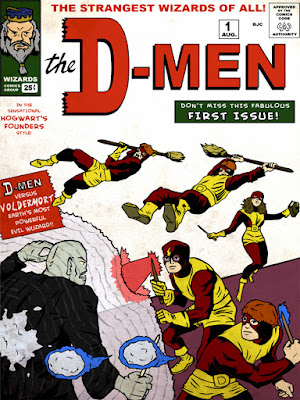
And to inject a bit of artistic "wizardry," artist Blair Campbell shows us Hogwarts' version of our heroes:
Finally, Byrne presents this battle in a way that could have given Marvel its first wraparound cover, had the masthead and captions been included. (And believe me, I gave it a try--anyone else care to take a crack at it?)


Uh, on that cover, what was the Beast swinging from, exactly?
ReplyDeleteIf he's doing a trapeze act, I assume there's gotta be a big pole somewhere.
Probably two.
Otherwise, I can't figure out what he's doing there.
M.P.
Well, M.P., FWIW, I just tell myself it came from the same place that the Angel snatched that pole, and leave it at that. :)
ReplyDeleteIn regard to the cover used in the Son of Origins book and on the Milestone edition, it came from a stat of how Kirby originally drew it. The telekinetic lines of force emanating from Marvel Girl were removed, and she was slightly re-positioned before publication of X-Men #1 back in the '60s.
ReplyDeleteThanks, Kid, good to know!
ReplyDelete