The "wrap-around" cover is probably a tricky thing to pull off. Presumably, a comic wouldn't draw attention to having a wrap-around cover unless the editor felt that it would not only generate sales, but also measure up in terms of outstanding artwork. Since the second factor would normally be dependent on the work of the regular artist on the book, there would understandably be occasions when the cover fell short of the mark--which sort of defeats the purpose of wanting to increase sales. You're not going to sell the amount of books you'd hoped for if your buyers are passing on the book at the rack.
But if it's done well, the wrap-around cover can indeed be a sales tool, particularly in those instances where the company has built anticipation toward an event culminating in the issue in question. And as this trend continued, most of these covers were not only wrap-around, but became fold-out as well, which certainly provided the issue you were about to read with a little extra bounce right up front. If I'm not mistaken, Marvel's first publication with this kind of cover was with issue #1 of the new X-Men series which launched in 1991:
And talk about going overboard--this representation, in four sections, not only made its way to four different issues (each splitting up the full artwork by Jim Lee you see above into four different covers), but a fifth issue was made available which contained all the sections in a fold-out wrap-around. We'd later see this sales tool get out of hand with "variant" covers, which would publish copies of issues with completely different cover art and thus obscure the perception the X-Men launch conveyed that Marvel was coaxing the buyer to purchase an extra copy in order to get the full artwork. A moot difference between apples and oranges, to be sure. As a cowpoke might put it, "hell, it's the same dance--just a different tune."
In a nod to Lee's depiction, have a look at its Marvel Zombies counterpart by artist Arthur Suydam:
Unlike zombies, though, who usually herald the end, we're just getting started.
For many of us, the one example of the wrap-around cover which first comes to mind would be the JLA/Avengers four-part series, with George Perez doing the cover art. Perez, while unquestionably a great penciller, will at times make such covers too busy with activity, too crowded with characters--and though they're great fun to pore over with the eyes, they're not necessarily the best representation of the story within. In these two examples, we can see each side of the coin--a story-related depiction vs. general all-out chaos:
Given the body of work that Perez has done in this area, he would seem to be the go-to guy when such work is called for. Not that you can blame the editor for wanting him on board:
For me, artist Neal Adams makes the best use of a wrap-around cover with this representation of the Kree-Skrull War which took place in a series of stories in The Avengers:
Just look at how well-used the entire landscape is here. Every part of the drawing generates excitement and interest in the whole story, with the montage boiling down most of the essentials in the space available. (I might have suggested adding the Supreme Intelligence, and certainly Rick Jones.) Adams simply hits it out of the park here. I've read this story numerous times, and this rendering makes me want to buy and read it again.
For the six-part series The Infinity War, artist Ron Lim, like Perez, obviously attempts to cram many of the story's characters into the wrap-around covers, but still manages to do a fine job of dedicating at least the center of each cover to representing that issue's story:
On occasion, we'll also see wrap-around covers which displays art that's either more on-point regarding the overall story or indicative of what the writer is trying to convey about the book. A few examples might be:
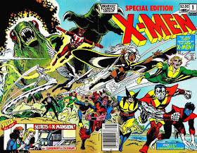
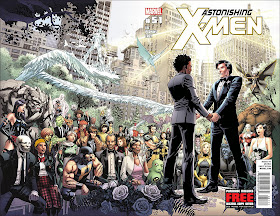
Circling back to the X-Men, we see that their wrap-around covers are prolific indeed, with a wide array of talent at the drawing board:
And since "X" ends the alphabet, we might as well close here. Be sure to chime in and mention wrap-around covers which have caught your eye!


Although these are wrap-around covers they aren't two equal halves and the main focus of the action is still on the right hand side where the front cover will be - they are a bit of a gimmick and all the great covers in comics history managed fine with one cover.
ReplyDeleteIt has always irked me to no end to see Yu draw Luke Cage's headband upside down virtually every time!
ReplyDeleteGood observation, Dirk--maybe in this case, the Skrulls just weren't thorough enough in their research! :)
ReplyDelete